News
Share article
How the interiors of a city centre primary school is setting a new blueprint for design
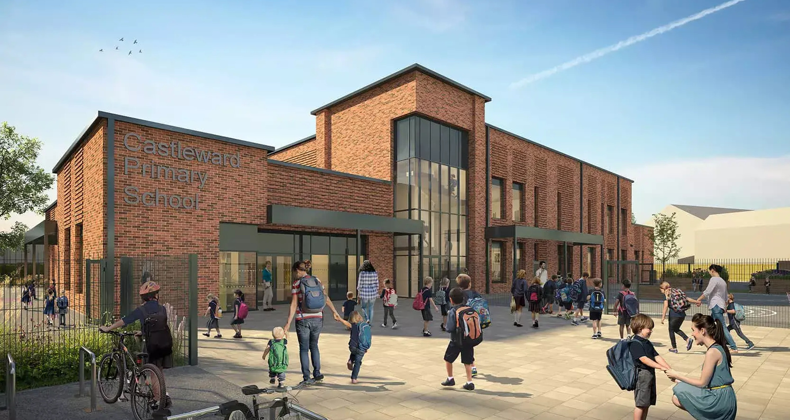
Derby’s city centre is soon to be home to an innovative, new one and a half form-entry primary school – and it’s a project that’s really excited our team. Forming part of a £100m housing-led regeneration scheme, Castleward Primary School will become the hub for the new community, attracting young families back into the city centre.

Aerial CGI of Castleward Primary School
The site of the new school is only 5,200m sq, which according to government guidance, is half the space usually required for a new build. This is an issue common to all city centre, brownfield developments, yet they share a common solution: build up, not out.
Associate director and interior architect, Craig Taylor, describes the challenges posed by the size of the school’s site and how our team has worked with the restrictions, turning them on their head and using them as a catalyst for creativity.
“External solutions to solve space shortages are important, but none more so than the creativity in design required internally”, Craig explains. “Every inch of floor space must be accounted for and have a role to play in supporting active learning.
As a space for playing, exercising, singing, dancing, eating and socialising; the heart space of any primary school is often the main hall. To make this area as multi-functional as possible, we’ve incorporated folding sliding doors, allowing the room to open up and create a larger area for whole school assembly, group activities, indoor play and wider community use.”

The main hall will act as a lightwell, maximising natural light into the heart of the school
Natural light has positive cognitive effects, which in turn not only support learning, but overall positive health and wellbeing too. The main hall is designed as a lightwell, where light will flood the centre of the school and pass through the corridors, which act as arteries. Windows rise above the play decks on the ground floor and first floor rooves, sucking in as much light as is possible and feeding it down into the heart of the school.
The ground floor classrooms are all situated around the main hall. This has not only meant that they benefit from the increased flow of natural light, but additionally, access from the main hall reduces the need for extraneous spaces such as corridors, where active engagement with the space is rare.
“Externally, the building’s height and strategic positioning give the school another dimension. Internally however, the design manifests around colour and uses elements of biophilic design and colour psychology to ensure the spaces connect with nature, offsetting the distinctly urban environment”, Craig continues.

The learning hub, creates a focal point for the school – a central room to which all roads lead, and light comes from
“The wealth of natural light plays a pivotal role in helping the children feel more connected to the outdoor environment, and it is aided by the use of colours that emulate the feeling of nature and further stimulate the cognitive benefits.” The ground floor features shades of green throughout, including a feature floor that creates the appearance of looking into a tree canopy, and acoustic panels in the hall keep the space feeling as open and comfortable as possible.”
As you move from the ground to the first floor, the colour graduates to more blue palettes, which not only add to the playful nature of the school, but act as an indicator of the children’s progression through school, with classrooms on the first level intended for the higher years.
“The abundance of natural light doesn’t just limit itself to having a positive effect on the children, but also the environment. We have designed the school with daylight-dimming LED lights to amplify the natural light rather than overtake it, ultimately making the school more sustainable and environmentally friendly.”

Castleward primary CGI
Share article


